proving it / what they saw
installation, print, art
role
art direction, concept, design, research
art direction, concept, design, research
 Proving It
11x22
 What They Saw
11x22

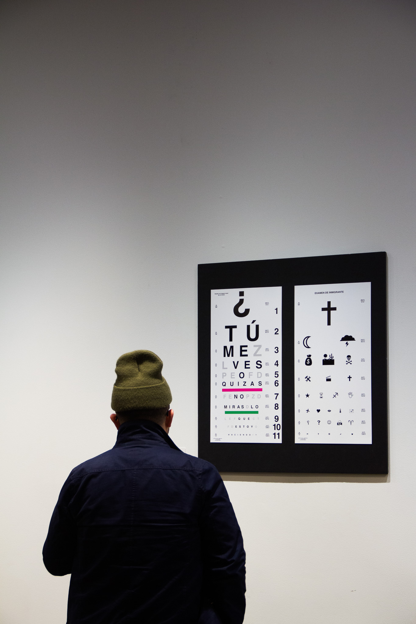
This interactive diptych piece puts the viewer in the shoes of someone else. “Proving It” is a way to express to others the unseen hardships of being First Generation American. “What They Saw” was born out as an homage to my parents’ immigrant background and journey.
I am interested in the language of words, symbols, and objects— their ambiguity and universality. In "Proving It", I am conveying an inner monologue that might often run in the minds of first generation children of immigrants while dealing with parental dissonance. In "What They Saw", I wanted to tell my family story through the eyes of my parents as newcomers to the country. This piece was part of the Crafted Member Showcase in February 2020.

I was inspired by the idea of the eye chart paired with an occluder as an everyday object, essential to testing our vision, but overlooked.
I studied old eye charts— the Snellen came first with its type resembling a slab serif and the Sloan eye chart came after, its type in the more geometric form, it was clean, no rough edges. I was really drawn to the first stylistic type of eye charts, but in the end decided to make this one look clean, I was more focused on the message of "In Proving It".


Being first generation in my family, I definitely think there's a weight to be carried of expectation from the people who bought us to this world while sacrificing themselves. Do what makes me happy? Do what makes them happy?
The message itself says "Tu me vez o quizás no miras lo que estoy haciendo?" (Do you see me or maybe you don't see what I'm doing?). There's a constant need to try to explain and reiterate accomplishments whether they make sense or not, but often times their idea of accomplishment and your own can be so different.

In "What They Saw", I used a mix of Webdings and Wingdings to tell the immigration story of my parents as they both came on their own paths and the adversity they faced to finally be fated in the States.
The use of Webdings and Wingdings in this piece was approached in a hieroglyphical sense. They are small icons that alone carry a connotation of their own and paired with other icons can create a relatable and powerful visual story. Icons for nature, travel, survival, and cosmic forces are recognizable and very similiar in most cultures around the world. “What They Saw” is formatted as an eye chart and test that is named “Examen Del Inmigrante” (The Immigrant’s Test). It is these icons that represent the shared landscape of an immigrant’s brave leap of faith as my parents did.


Crafted is collective of BIPOC creatives in design, advertising, and tech formed with the purpose of navigating our industries while building better ones.
Installation photographed by German Acosta.
greater philly craft beer trail
illustration, painting, artrole
art direction, implementation, project management
team
illkya acosta, artist & project manager
brianna branco, collaborator & assistant
sindoor shah, design director, visit philadelphia
will horrocks, liason, our people entertainment
clients
visit philadelphia
our people entertainment
art direction, implementation, project management
team
illkya acosta, artist & project manager
brianna branco, collaborator & assistant
sindoor shah, design director, visit philadelphia
will horrocks, liason, our people entertainment
clients
visit philadelphia
our people entertainment
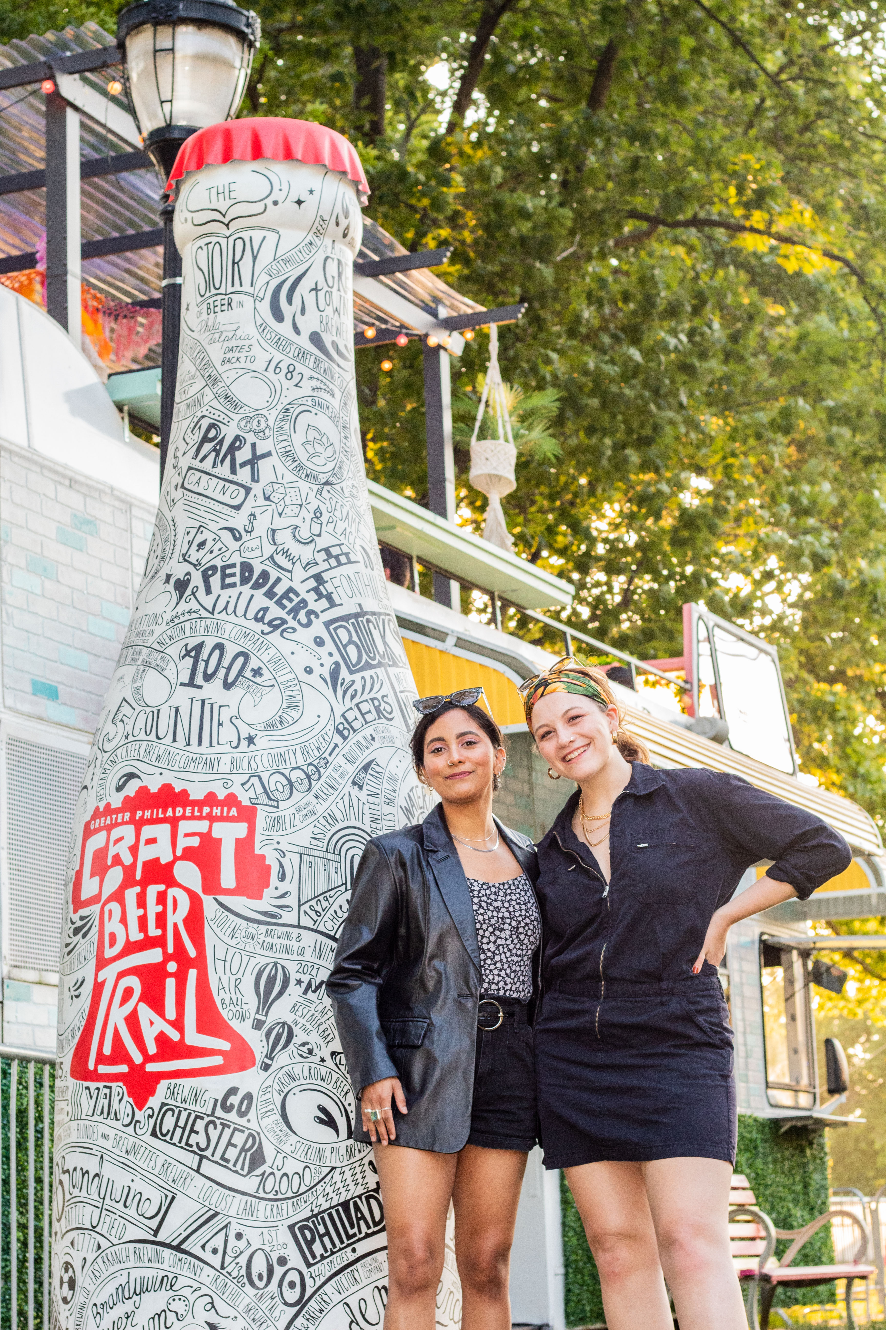
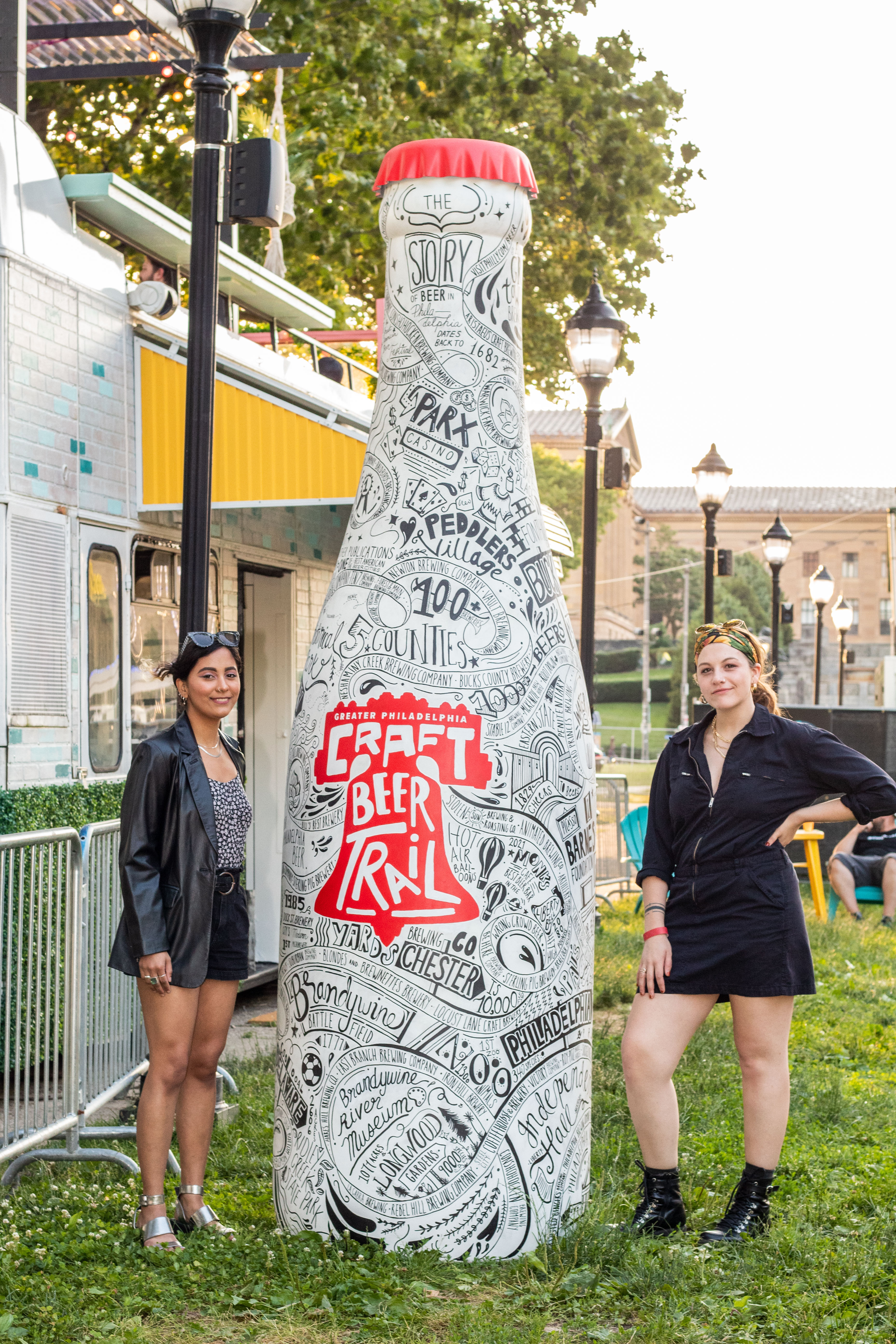
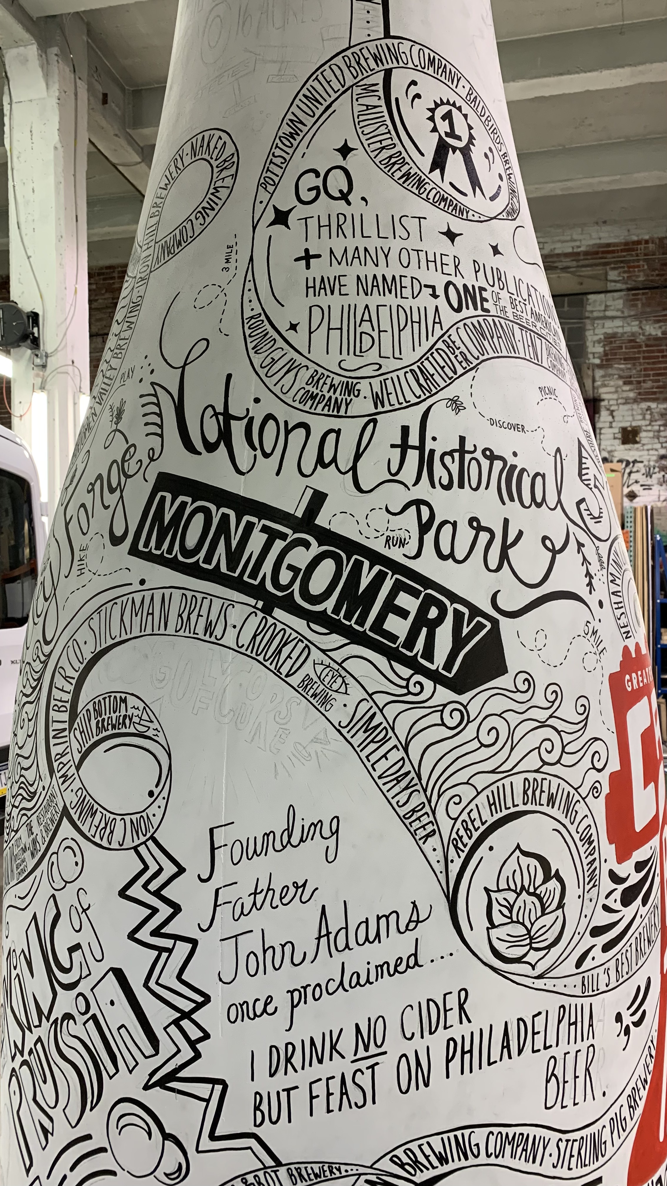
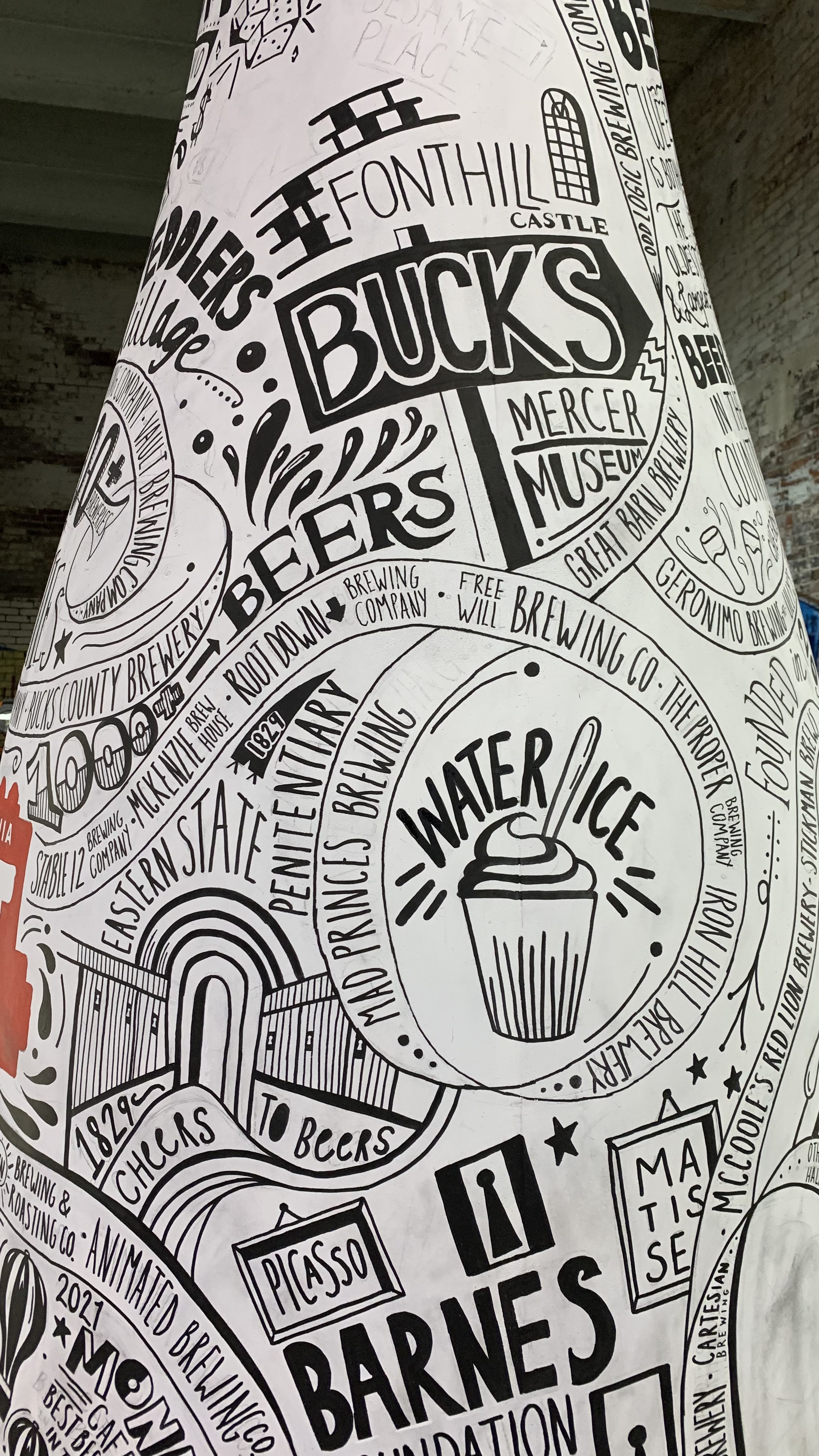
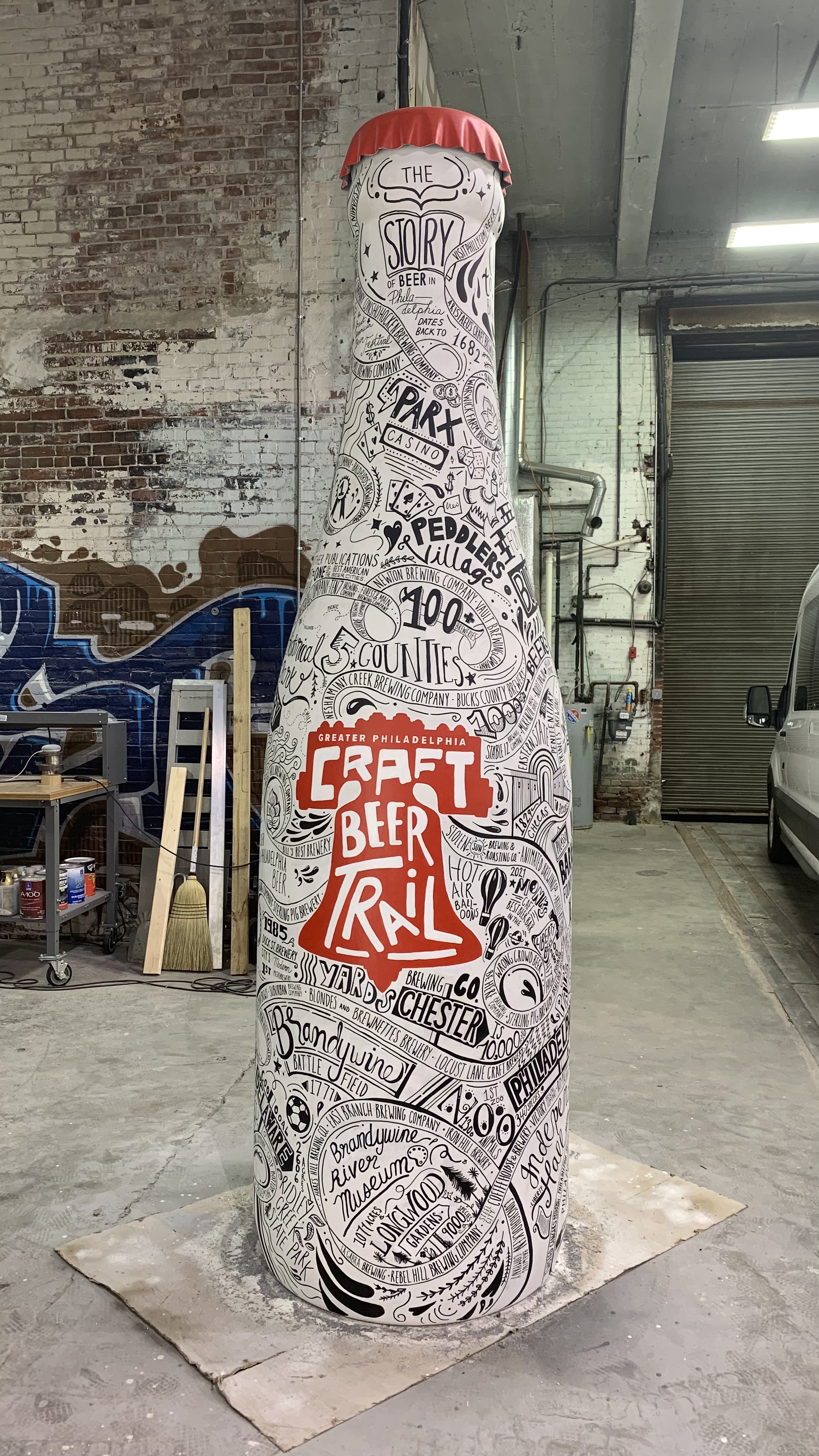
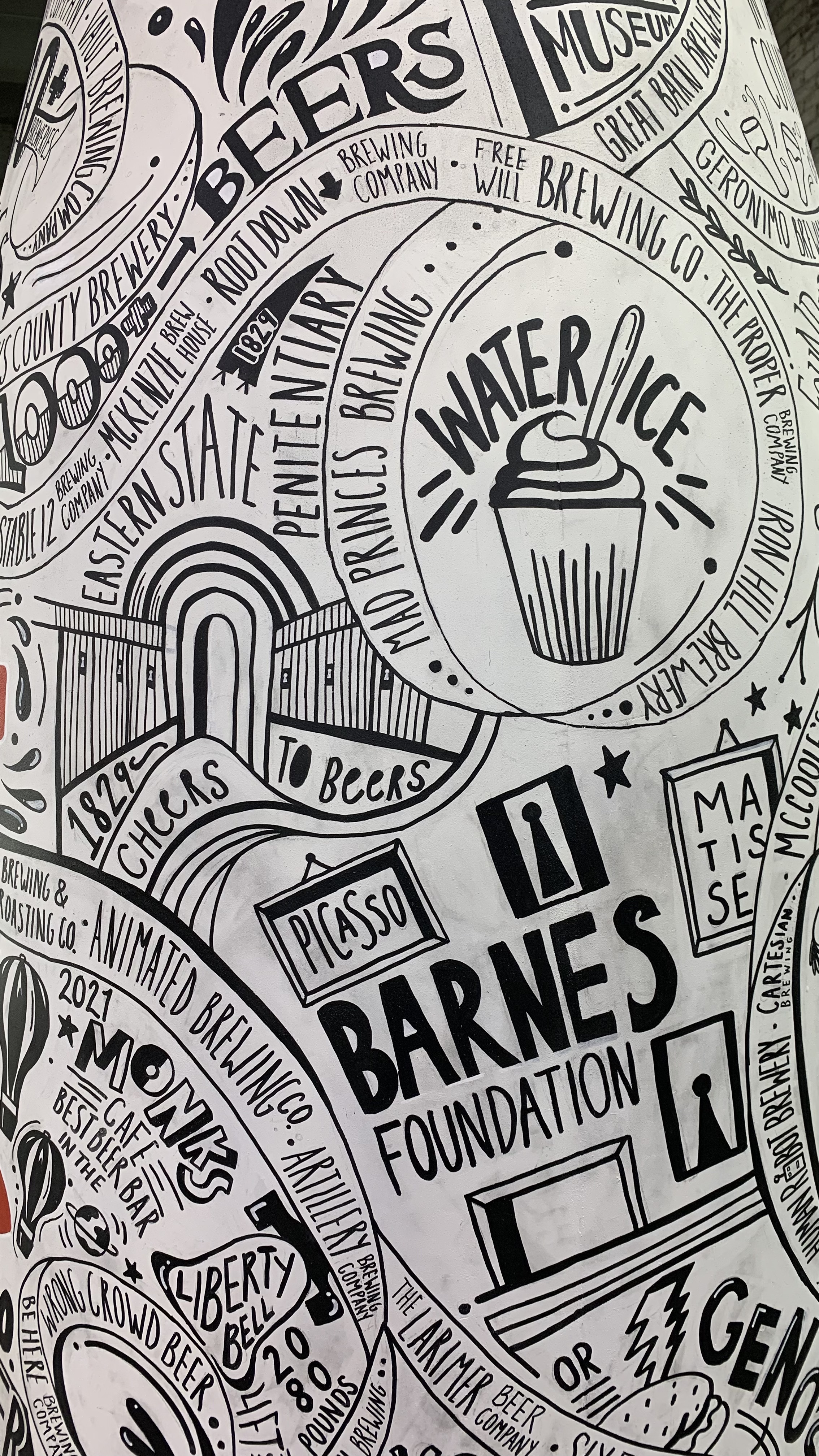
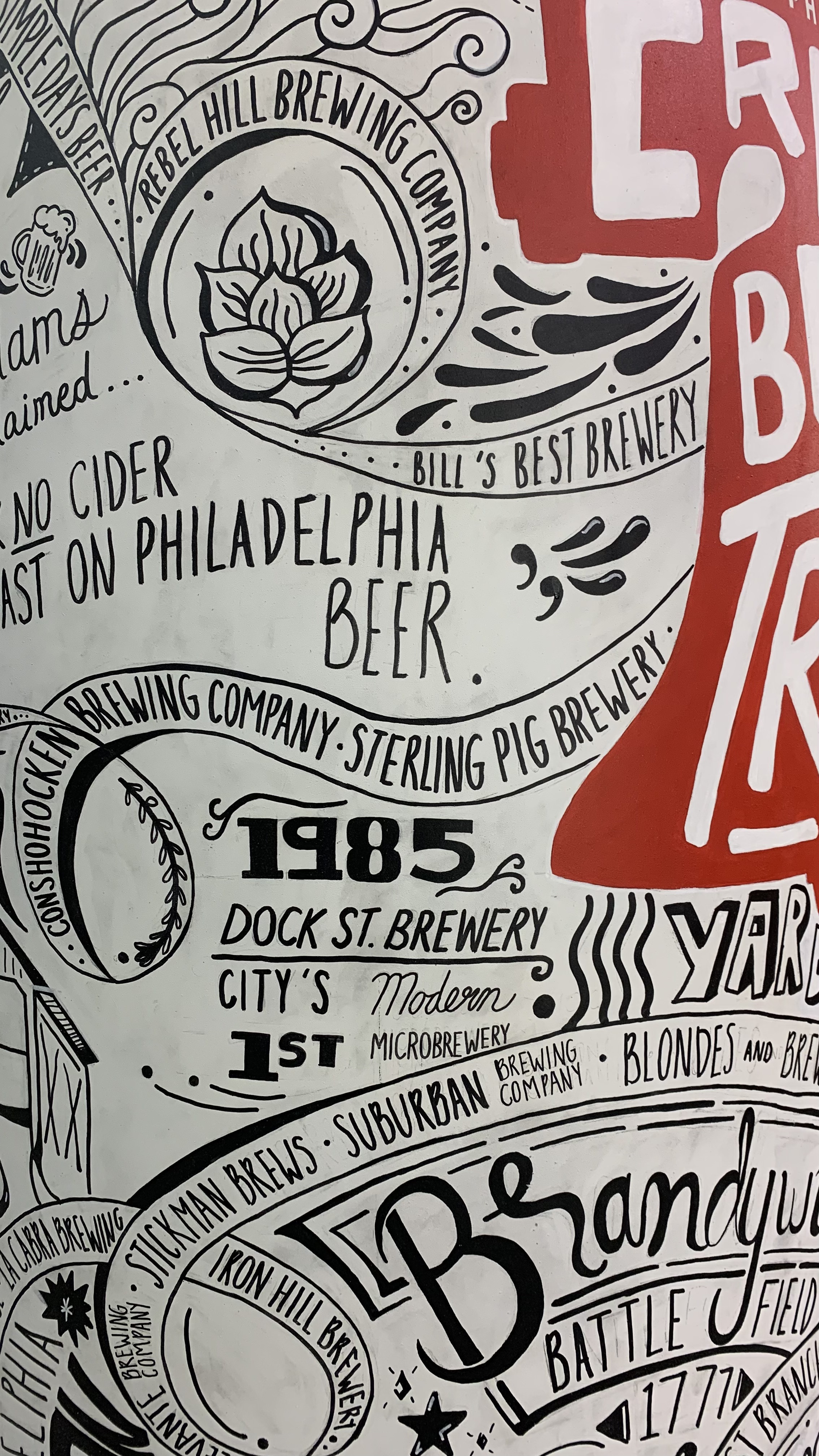
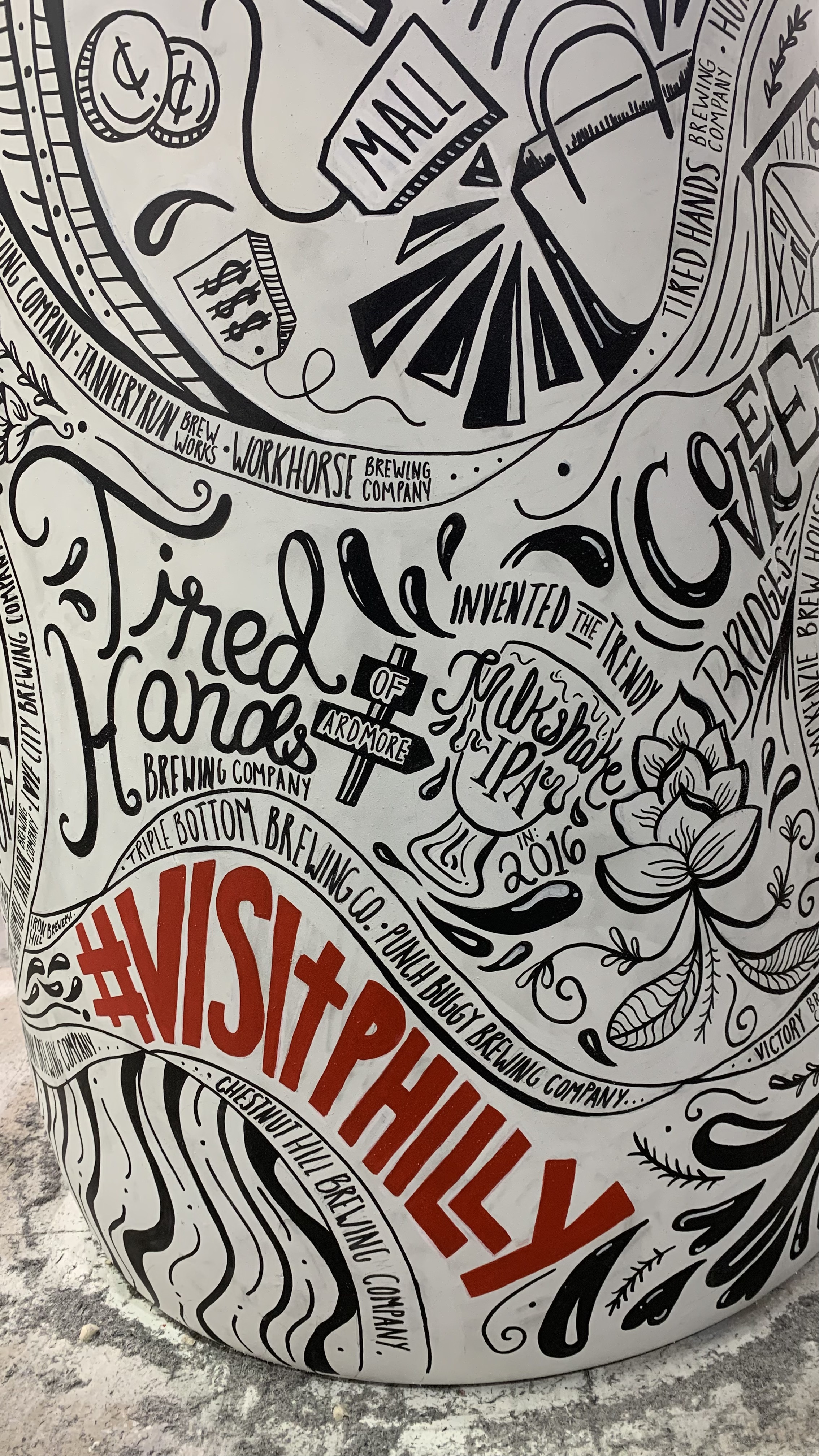
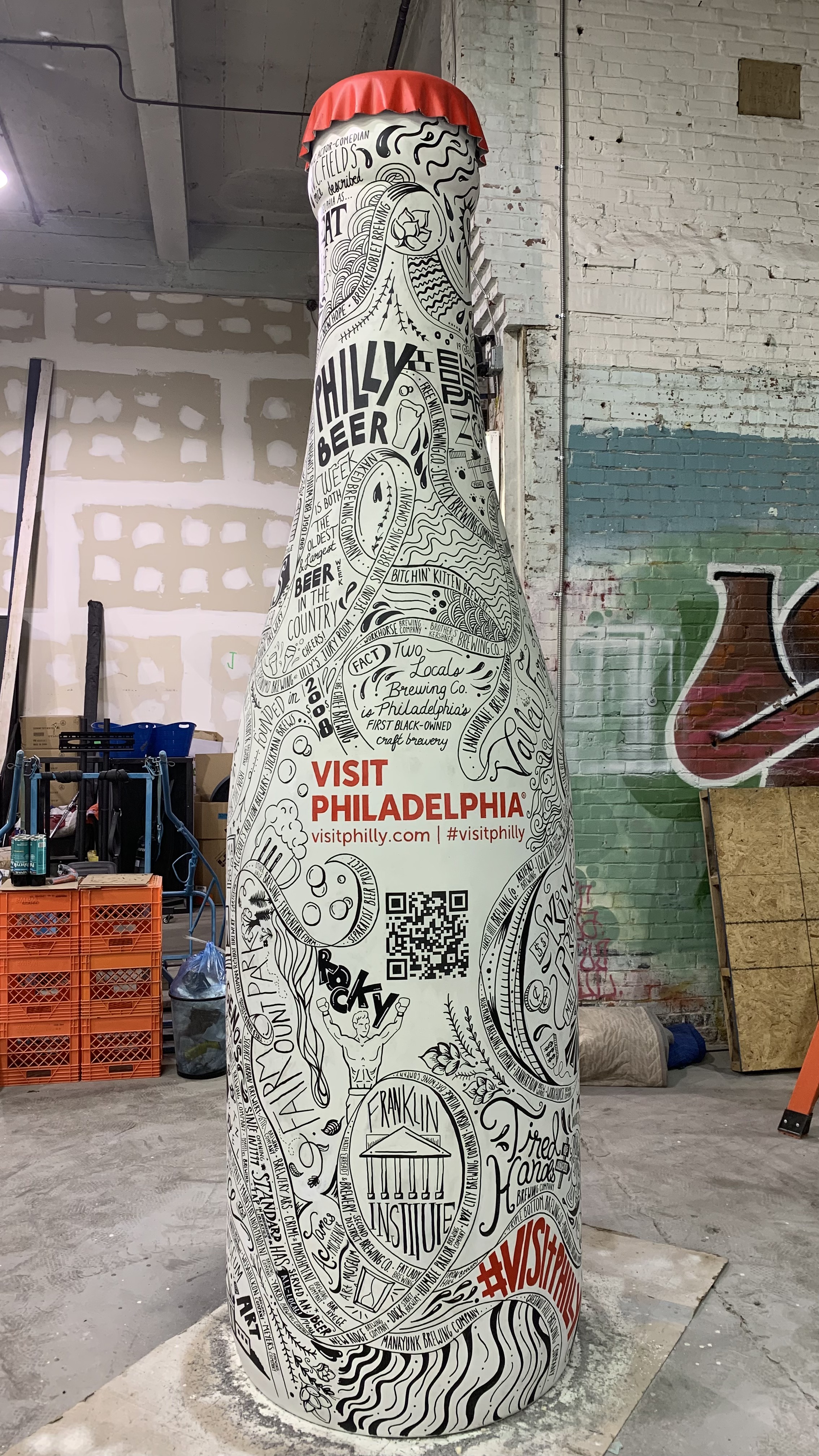
The Craft Beer Trail of Greater Philadelphia is a map, comprehensive guide, and a homage to the area’s bustling and devout brewery rennaisance. This region is home to 90+ craft breweries with more than 110 locations across 5 counties. I had the pleasure of stylizing a giant thrifted 7-UP bottle into a piece of art that reflected this area’s diverse lineup of breweries and brewpubs.
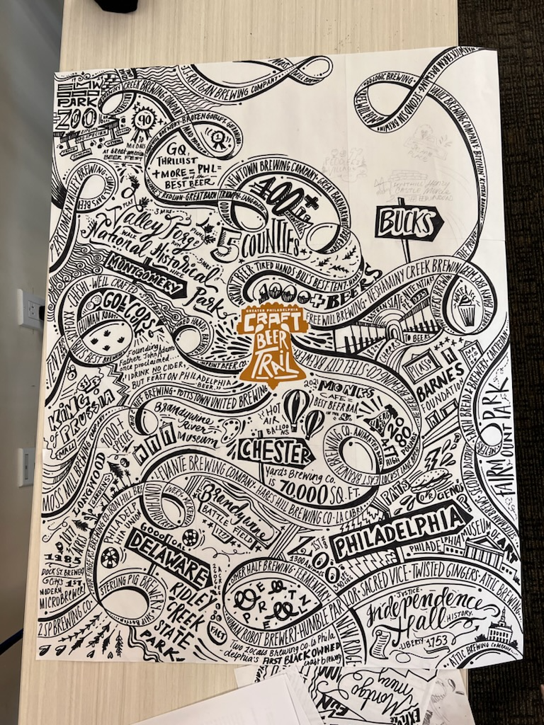
I was commisioned to be the artist to carry out the execution of this project towards the end of May 2022 by Will Horrocks of Our People Entertainment. I invited Bri Branco, a talented illustrator and designer, to assist me in taking the bottle from blank slate to an elevated focal point. This piece features a bunch of playful and eye-catching names, doodles, and trivia of all the breweries of Greater Philadelphia which encompass 5 counties: Bucks County, Chester County, Delaware County, Montgomery County, and Philadelphia County.
The 10-ft tall beer bottle premiered as part of the Oval XP in mid-June 2022, greeting guests and standing pretty for photo-ops at the entrance of the beer garden which concluded in mid-August 2022.
The 10-ft tall beer bottle premiered as part of the Oval XP in mid-June 2022, greeting guests and standing pretty for photo-ops at the entrance of the beer garden which concluded in mid-August 2022.
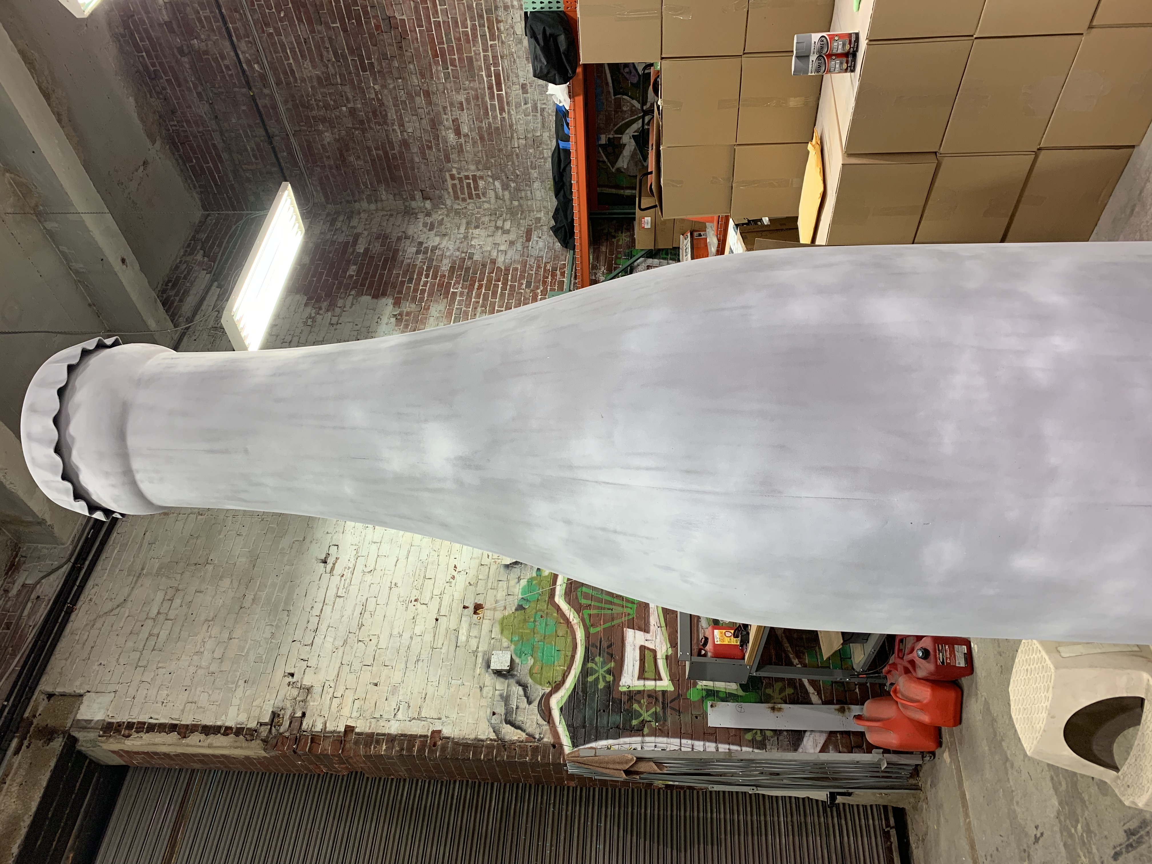
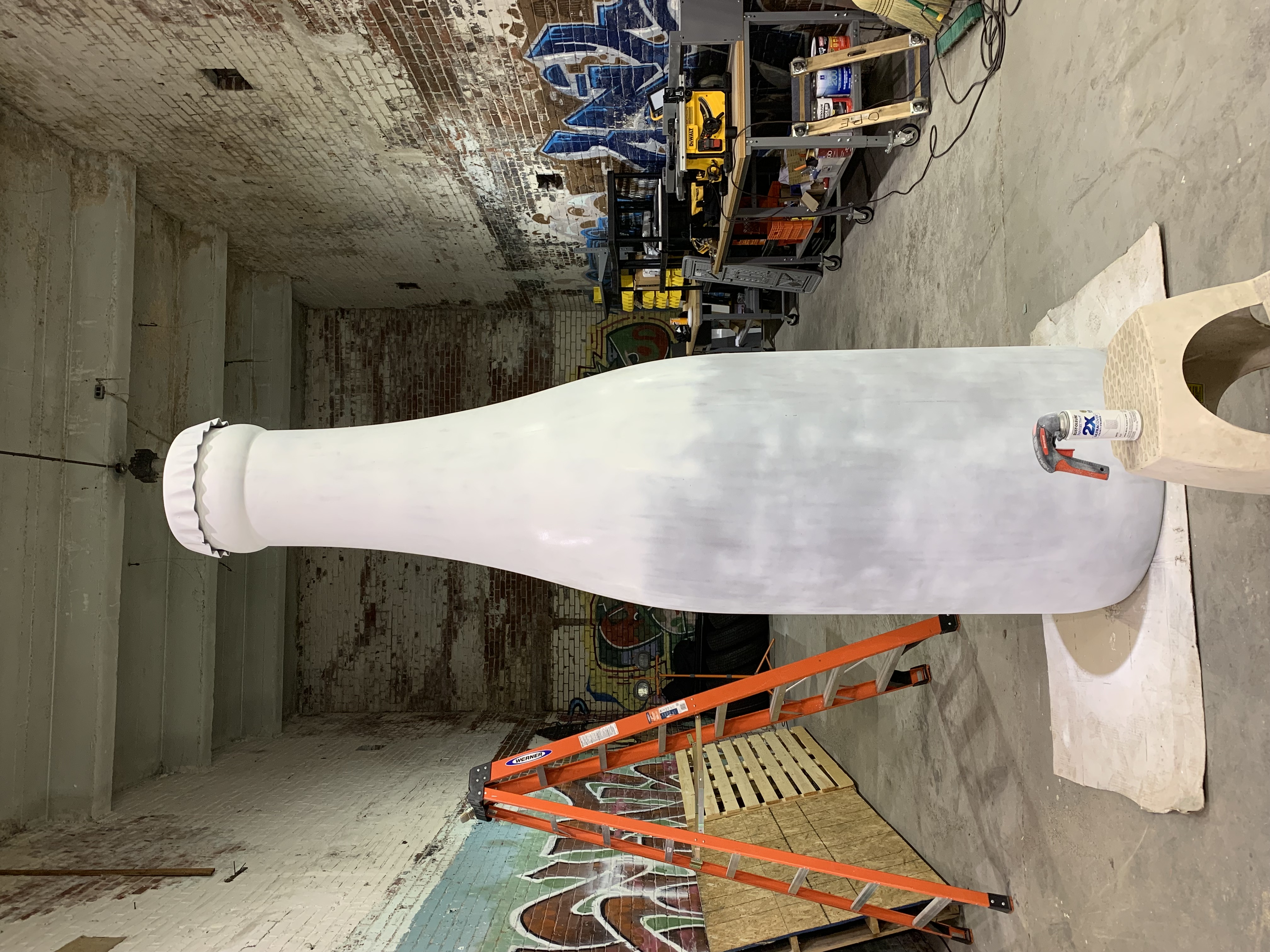
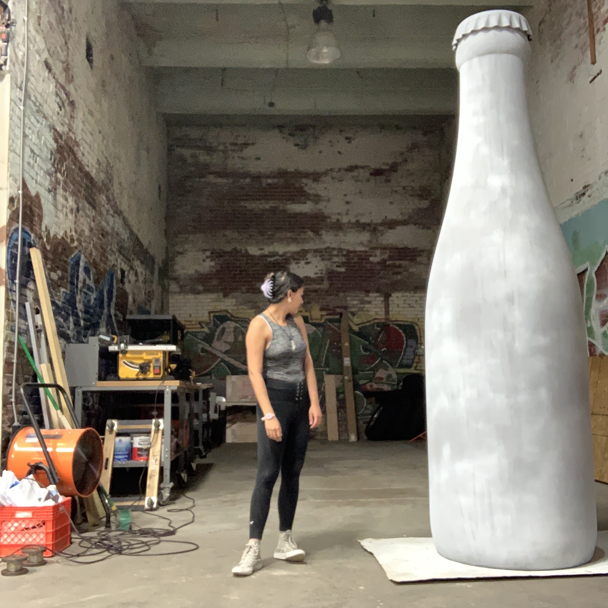

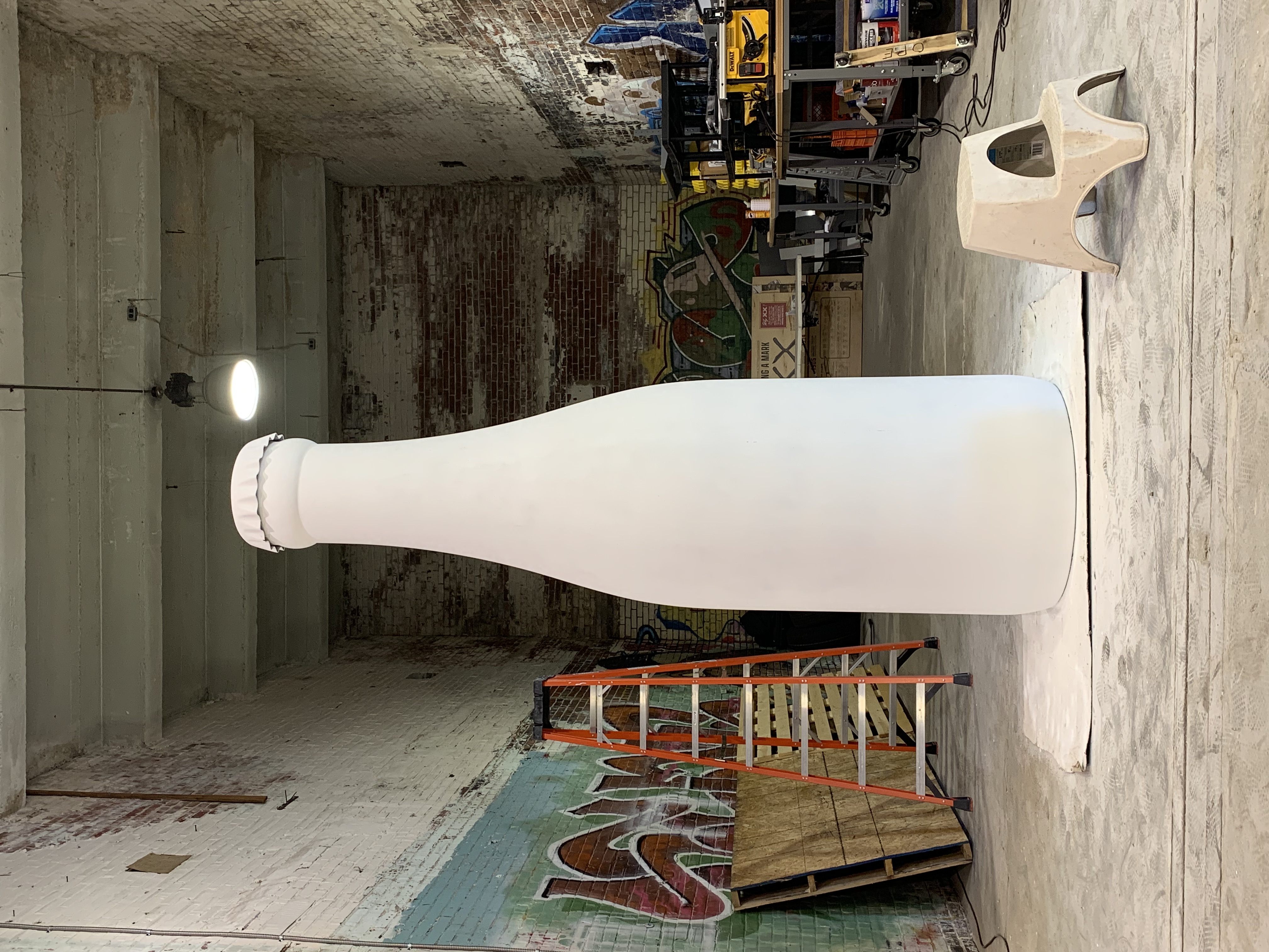
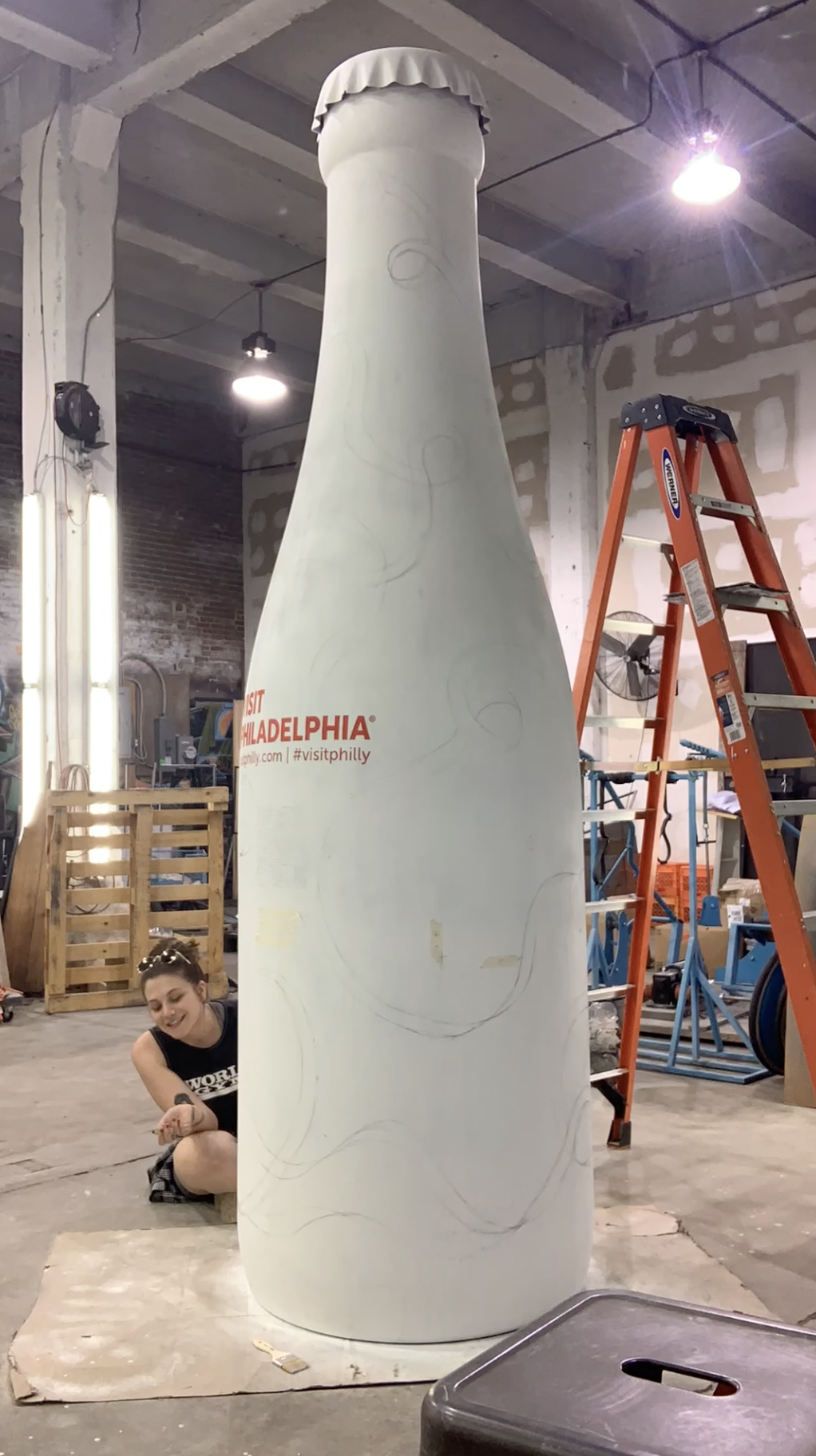
I had to take the bottle from its bland grey primer coloring and coat it with a flat white spray paint for a uniform look— this took about 2-3 days to get a nice even finish with drying time in between each layer. I had to wait about a day to start to sketching and mapping out the artwork placement before painting the work in.
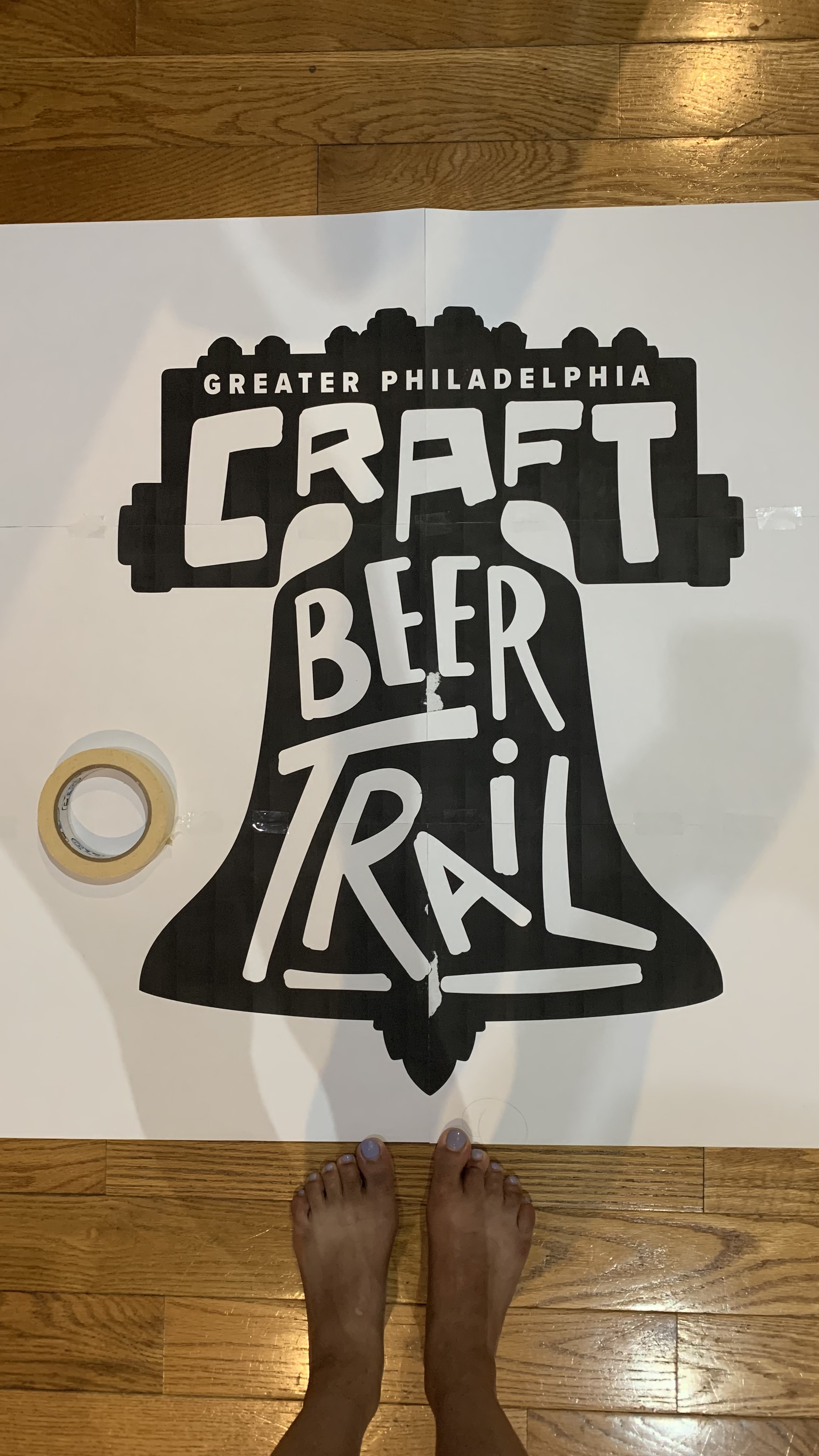
The right shows myself mapping one of the important elements— The Greater Philadelphia Craft Beer Trail logo using carbon transfer paper.
The right shows myself mapping one of the important elements— The Greater Philadelphia Craft Beer Trail logo using carbon transfer paper.
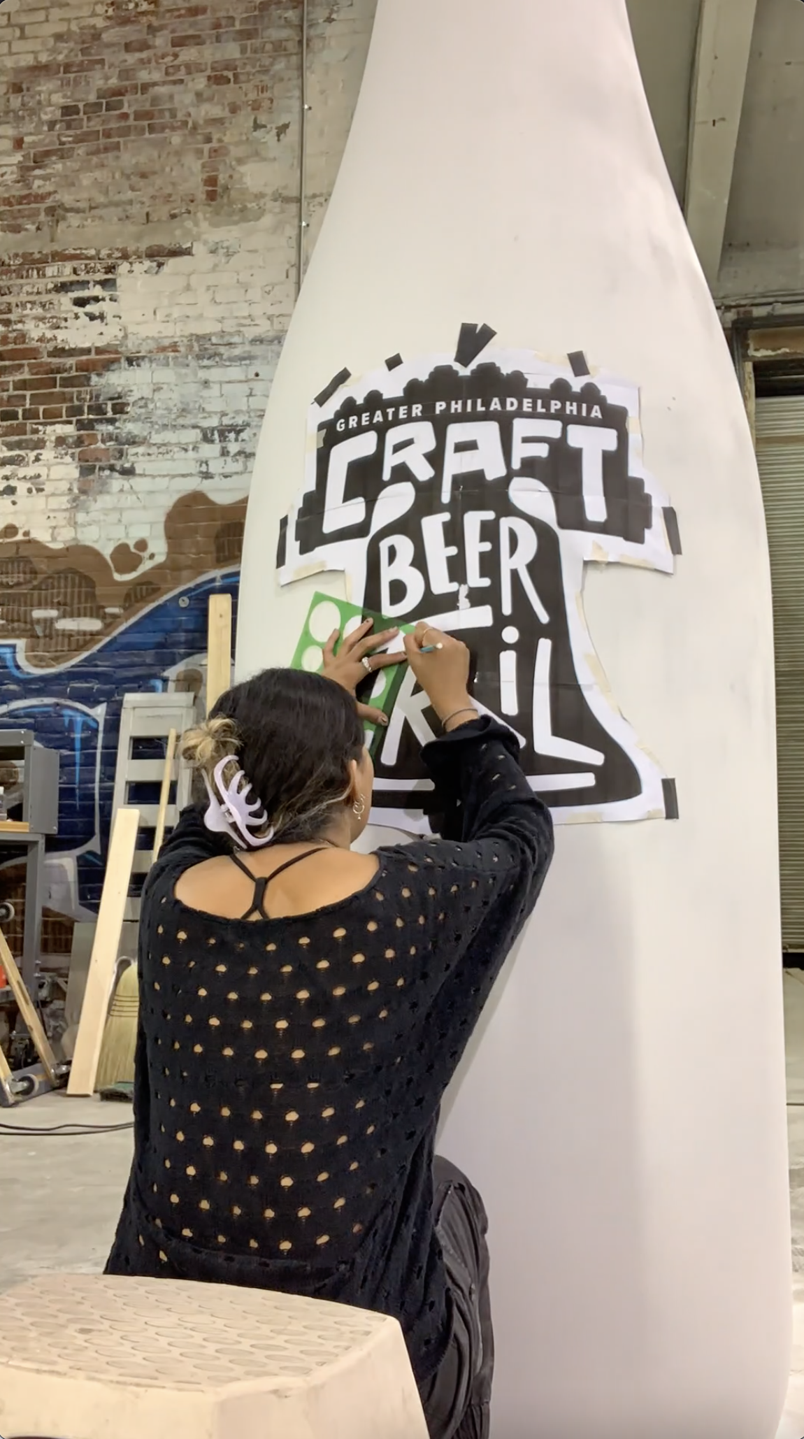
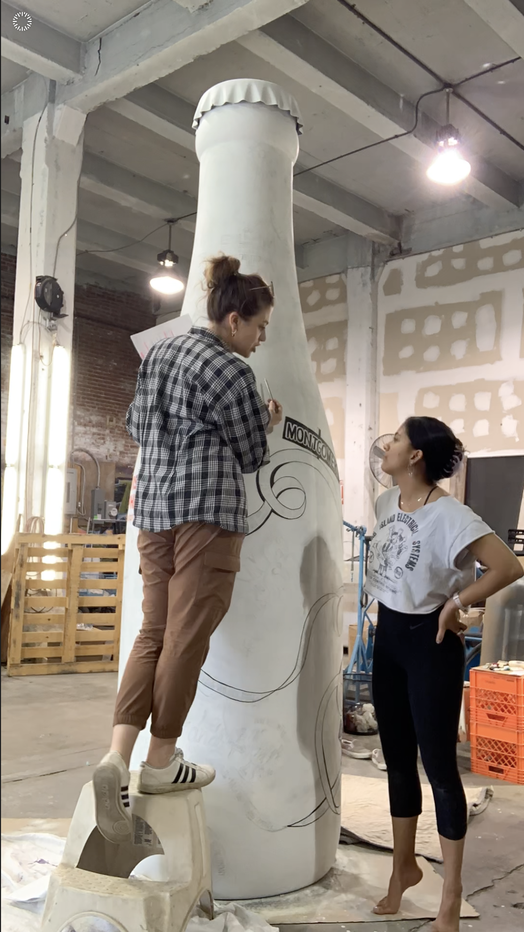
Adapting a flat design to a round surface definitely proved to be a challenge for myself as a non-math enthusiast. Thanks to Bri’s prior experience with mapping and scaling from flat concepts to 3-d object, she established an extremely helpful grid system (vs. the idea of using a projector or freehanding it). This grid system was a rough placement map— it also allowed us the flexibility to wrap the illustration around the giant beer bottle in an organic fashion— it was a very forgiving method if we had to add, remove, or enlarge certain elements.
Bri and I worked together in making the expressive typography and illustrations as close in spirit as it was in the provided sketch from Visit Philly’s design director. We kept in mind to have fun while trusting ourselves and each other our own special touches and interpretations.
Here is a snippet of Bri and I’s gargantuan efforts to ornament a bottle twice as tall as us on TikTok.
Shoutout to Visit Philly’s Rob Rabena for recording us in action.
Shoutout to Visit Philly’s Rob Rabena for recording us in action.
love + grit storefronts project
digital, print, art
role
art direction, concept, design, research, project management
team
illkya acosta, artist
black and mobile, client
grant blvd, client
conrad benner, project curator
ginger rudolph, project curator
art direction, concept, design, research, project management
team
illkya acosta, artist
black and mobile, client
grant blvd, client
conrad benner, project curator
ginger rudolph, project curator


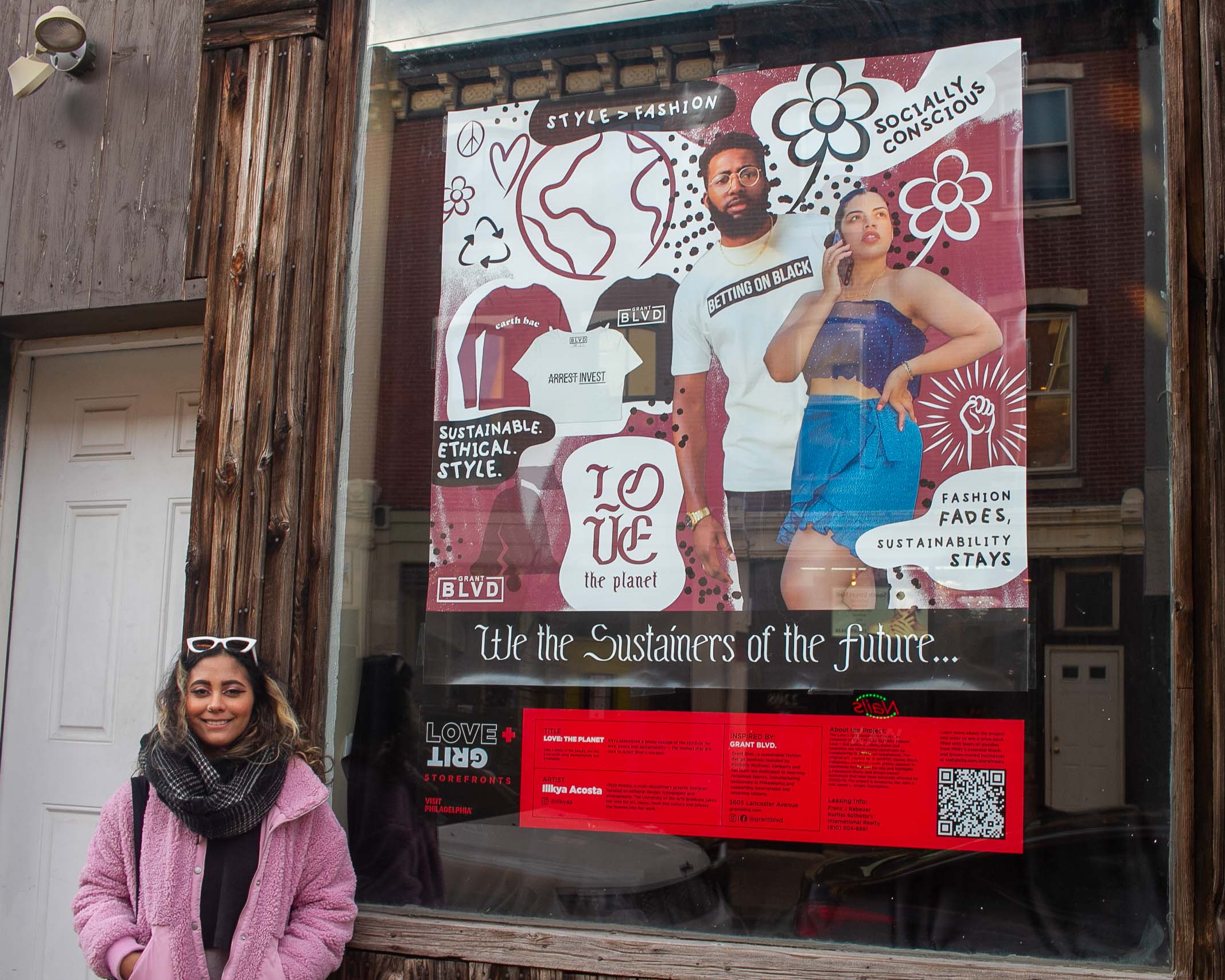
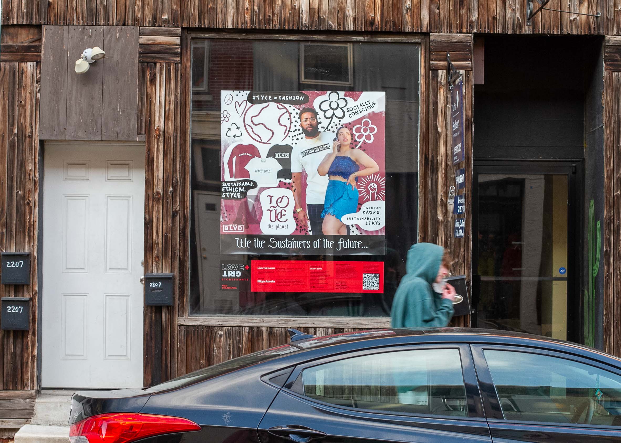
Love + Grit Storefronts Project is a citywide exhibition transforming empty spaces into art installations by QBIPOC artists highlighting Black- and Brown-owned businesses affected by the pandemic. The art appears in storefronts in multiple neighborhoods— from Chinatown and Roxborough to Northern Liberties and Northwest Philly.
I was commisioned to be a part of this project at the start of Fall 2021. Curated by Conrad Benner (of photo blog Streets Dept.) and curator Ginger Rudolph, the installation features works by 12 QBIPOC artists. I collaborated with two businesses that served as the inspiration for my custom-made digital artwork.
I was given the pleasure to create a piece for the Philadelphia-based food delivery app, Black and Mobile, as well as sustainable fashion shop, Grant Blvd.
This project was unveiled in November 2021. You can catch a snippet of me here talking about my process on the love + grit Instagram.
I was given the pleasure to create a piece for the Philadelphia-based food delivery app, Black and Mobile, as well as sustainable fashion shop, Grant Blvd.
This project was unveiled in November 2021. You can catch a snippet of me here talking about my process on the love + grit Instagram.


For Black and Mobile, I decided to depict a nightscape in the city with a range of late night foodies.
The folks at Black and Mobile were very happy with how it turned out. They made it known that just because their app serves as a vehicle for Black-owned restaurants’ food to be ordered, that anyone of any background can utilize the BAM app to further support Black-owned businesses!
I highly encourage anyone viewing this project to order some food from their app.

For Grant Blvd, I decided to incorporate some of the photography from their website.
I used the color palette of the fall season collection that was featured as my personal palette for this piece. I also added some illustrative use of relevant (earth, recycle, peace, love) symbols mostly hand drawn by myself with the exception of The Liberty Bell graphic.
I highly encourage anyone who loves fashion and sustainability to take a look at Grant Blvd’s website to see what their latest collection is comprised of!